Components
Accordion
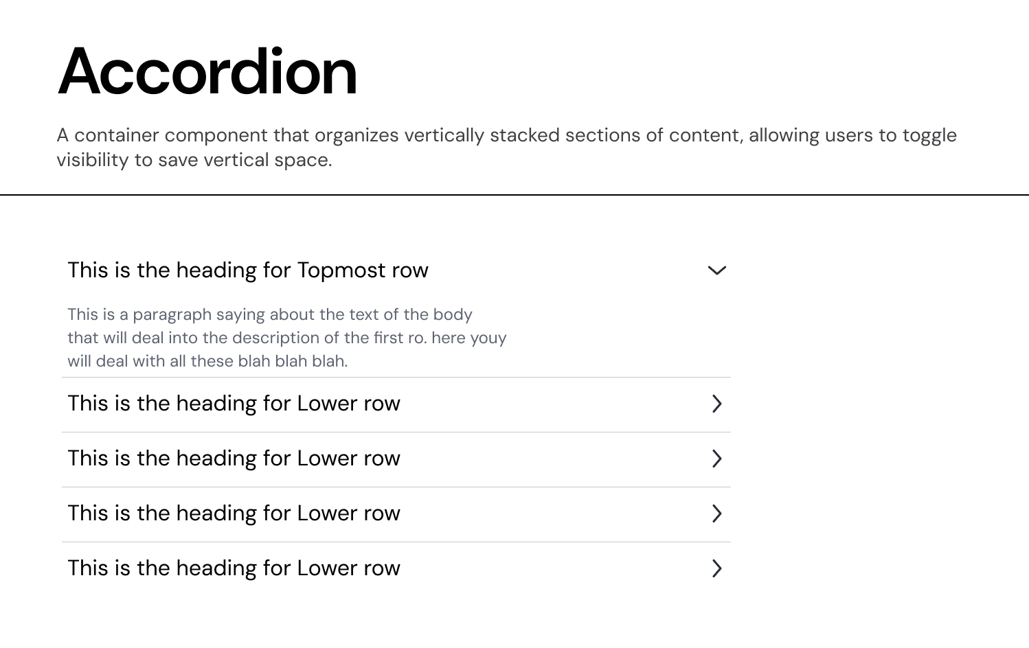
An Accordion is a vertically stacked list of interactive headers that allows users to toggle the visibility of associated content. It is used to manage high-density information by progressively disclosing details only when required.
Usage Guidelines:
Do Use for complex lists where users need to compare or focus on specific items one at a time.
Do Use to nest child data (e.g., "Deal Details") under a parent category (e.g., "Fund Overview").
Do Not Use if the content is critical and must be visible at all times (use a standard List or Card).
Anatomy & Properties:
Our system distinguishes between two structural levels to support deep data hierarchies:
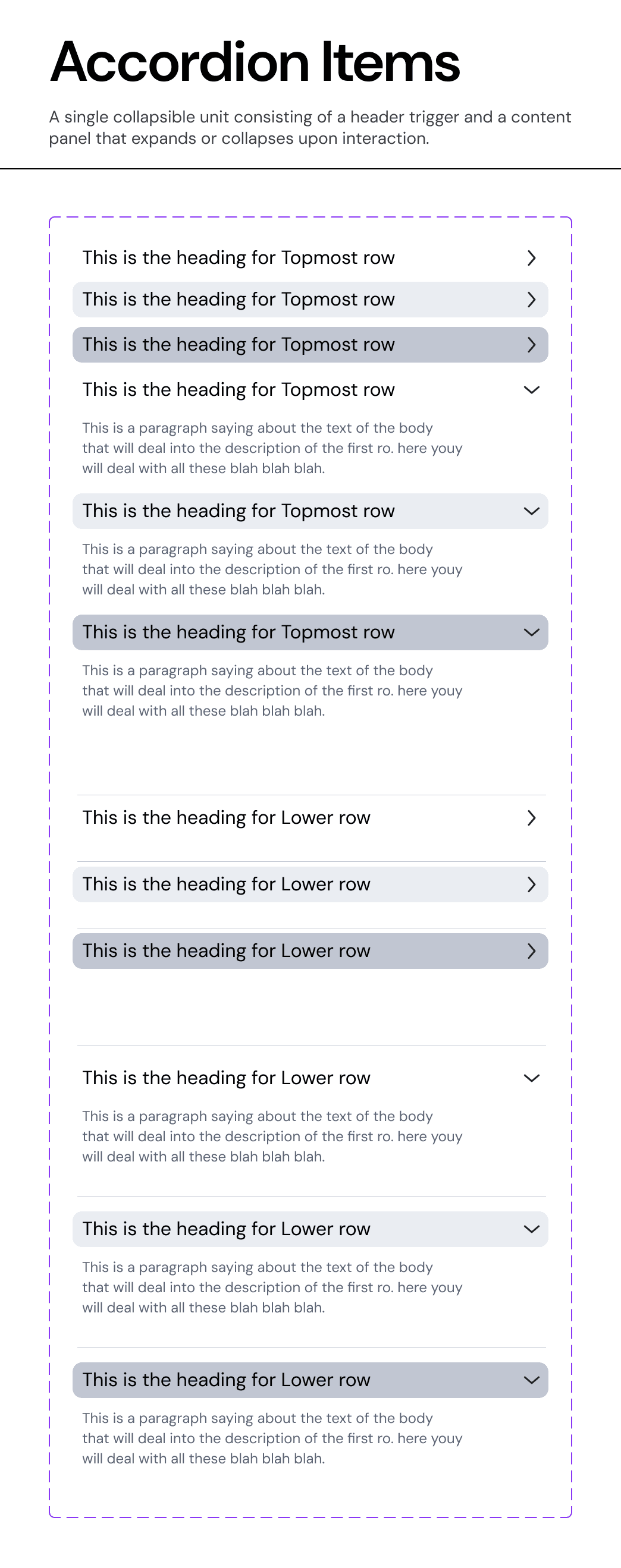
A. Top Row (Parent)
The primary container level.
Visuals: Uses a prominent text style (
Heading Label) and standard padding.Behaviour: Clicking expands the section to reveal either a content panel or a list of "Lower Rows."
B. Lower Row (Child)
The nested level.
Visuals: Indented or visually distinct to indicate subordination to the Top Row.
Usage: Used for sub-items, specific line items in a funding round, or granular settings.
Content Structure:
Unlike standard accordions that only support a title, our component is designed for rich data:
Heading Label: The primary identifier (e.g., "Fund Performance").
Body Label: A secondary description line (e.g., "This is a paragraph saying about the text...") that provides context before expansion.
Configuration (Properties):
The component is built as a flexible stack, allowing designers to toggle rows on/off to fit the data density:
Row Toggles:
hasTopmostRow,has2ndRow,has3rdRow, etc..Type Assignment: Each row can be explicitly defined as
Top RoworLower Row.
Variants:
Standard Accordion:
Independent behaviour. Opening "Section A" does not close "Section B".
Usage: Forms where users might need to reference multiple sections simultaneously.
Single-Select Accordion:
Mutually exclusive behavior. Opening "Section A" automatically closes "Section B".
Usage: Mobile interfaces or strict step-by-step processes where focus is paramount.=
Join our Community Forum
Any other questions? Get in touch