Tokens
Stroke
The Stroke system defines the thickness of borders used for structural separation, focus states, and selection indicators. Unlike color, stroke weight adds a layer of depth and interaction feedback without relying solely on contrast.
Logic:
Our stroke scale is calibrated to balance subtlety (for structure) with prominence (for interaction).
Naming Convention:
All semantic tokens follow a strict taxonomy: Category (Background) — Group (Neutral) — State/Role (Primary)
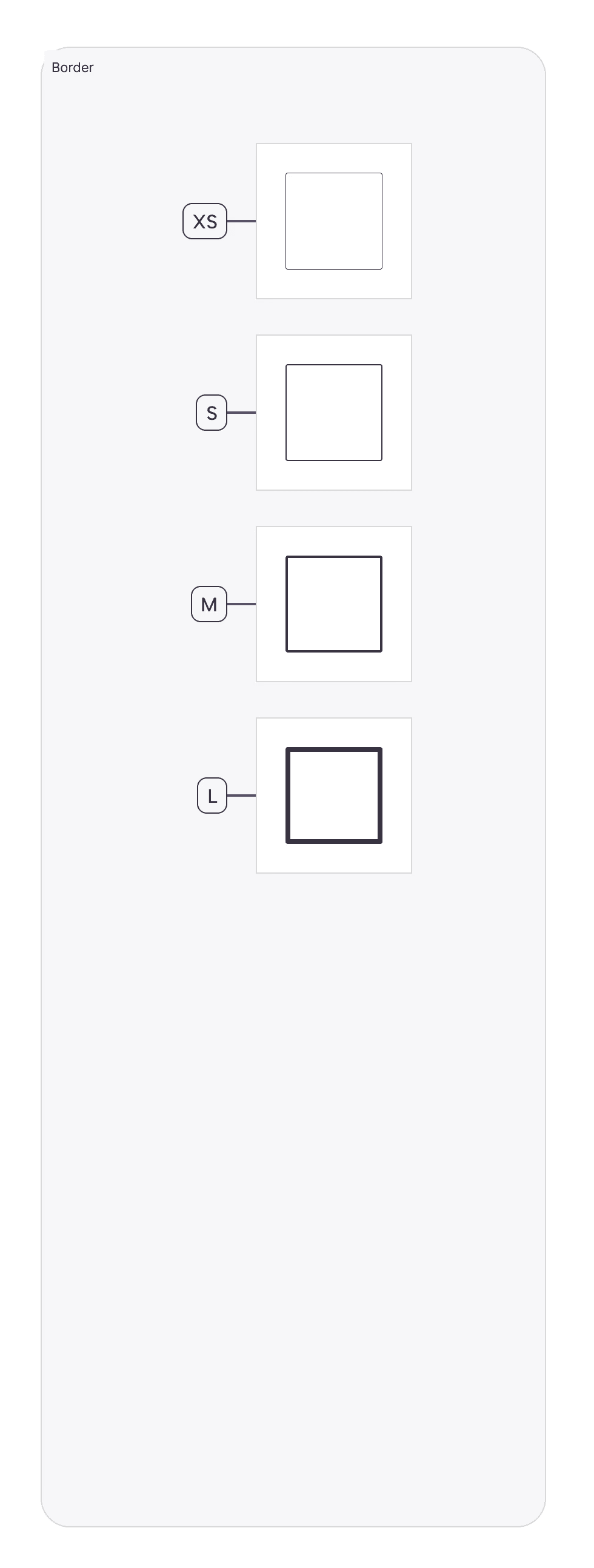
Stroke Width Tokens:
Stroke-XS(1px):Usage: The default border width for all containers, inputs, and dividers.
Why: 1px is the standard "hairline" width that defines a boundary without adding visual bulk. It is used for 90% of UI elements (Cards, Text Fields, Table Rows).
Stroke-S(2px):Usage: Active states, selected items, and primary focus rings.
Why: Doubling the width (2px) creates a clear visual "pop" that signifies user selection (e.g., A selected Card in a grid) without needing a color change.
Stroke-M(3px):Usage: High-emphasis focus states or specialized data visualization borders.
Why: Used rarely, typically to denote a critical active state or a specific chart line weight.
Stroke-L(4px):Usage: Brand moments or heavy containment.
Why: 4px is a "Heavy" stroke used for featured content or specific "Selected" states in dense dashboards where 2px might be missed.
Stroke Usage Guidelines:
Internal Dividers: Always use
Stroke-XSwith aNeutral-Subtlecolor. Dividers should never compete with content.Input Focus: When a user clicks a text field, the border transforms from
Stroke-XS(1px) toStroke-S(2px) and changes color toBrand-Primary. This "thicken and color" interaction is a core accessibility pattern.Card Selection: Selected cards use an "Inside Stroke" of
Stroke-S(2px) to prevent layout shifts (the card doesn't grow; the border grows inward).
Join our Community Forum
Any other questions? Get in touch