Components
Form
A Form is a structured group of input controls that allows users to enter, edit, and submit data. It serves as the primary interface for data collection and object creation.
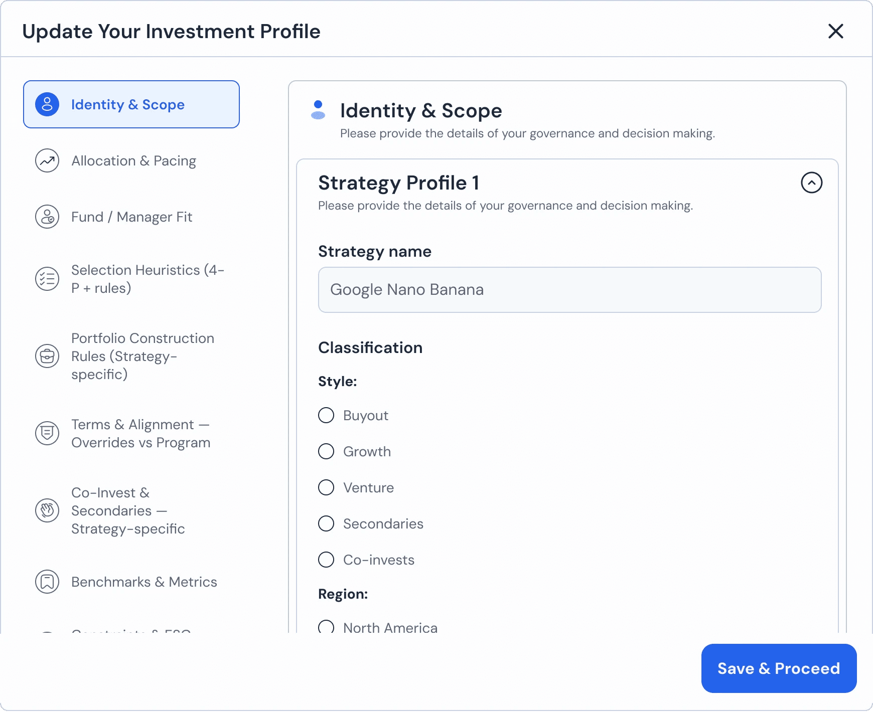
Single nested form:
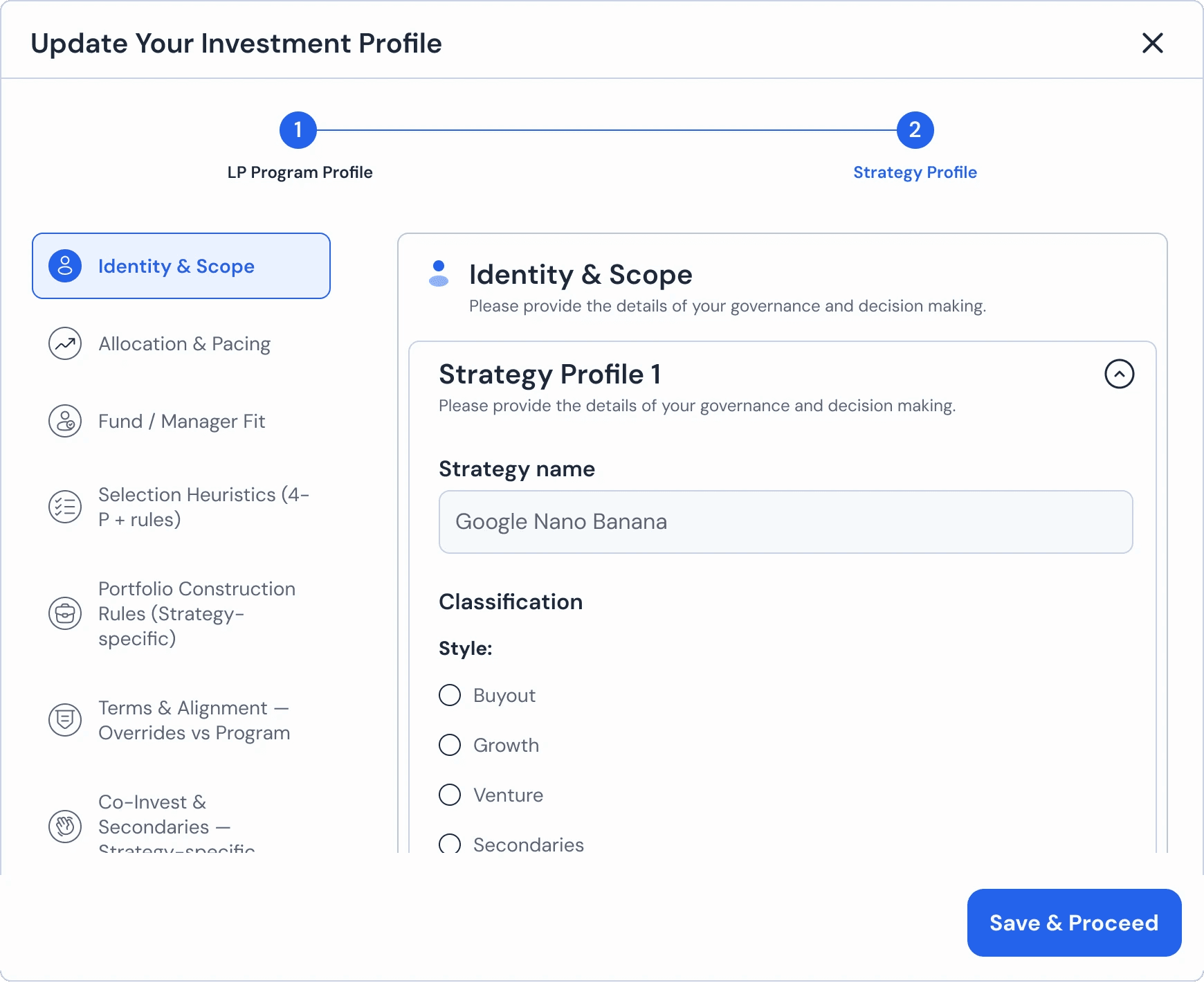
Multi nested form:
Usage Guidelines:
Do Use logical groups (Sections) to break down long forms into digestible chunks.
Do Use progressive disclosure (e.g., expanding sections) to hide advanced fields until needed.
Do Not Use long, scrolling forms in a modal if the content exceeds two viewports (use a full-page layout or Wizard instead).
Form Structure & Hierarchy:
Our system supports two distinct architectural patterns to handle varying data density.
A. Single-Nested Form (Standard)
The default structure for linear data entry.
Layout: A flat list of input groups.
Structure:
Section Header->Input Fields.Usage: Best for simple profiles or settings where all fields are peers (e.g., "Identity & Scope").
B. Multi-Nested Form (Complex)
A hierarchical structure for complex data relationships.
Layout: A parent container holding multiple child forms.
Structure:
Sidebar Navigation(Parent Categories) ->Main Panel(Child Forms).Usage: Best for "Object-within-Object" editing. For example, defining a "Strategy Profile" inside an "Investment Profile."
Behavior: Selecting a category on the left (e.g., "Identity & Scope") dynamically updates the form on the right without reloading the page.
Grouping & Layout
Field Groups: Related inputs are grouped visually using whitespace or subtle borders (
Border-Neutral-Subtle).Column Logic:
Single Column: Used for linear flows to prevent eye-scanning fatigue.
Double Column: Used for related data pairs (e.g., "First Name" + "Last Name") to save vertical space.
Actions
Primary Action: The "Save & Proceed" button is fixed at the bottom right of the container.
Validation: The primary action is disabled until all required fields in the current view are valid.
Join our Community Forum
Any other questions? Get in touch