Components
Spinner (Busy Indicator)
The Spinner is a looping visual indicator used to signal that the system is processing a background task. It reassures the user that the application is active and prevents them from performing conflicting actions during latency.
Usage Guidelines:
Use when the wait time is indeterminate but expected to be short (typically 1–4 seconds).
Do not use for long-running processes (e.g., >5 seconds). Use a Progress Bar or a detailed status notification instead.
Do not use multiple spinners simultaneously on one screen. If loading an entire page, use a skeleton loader or a single central spinner.
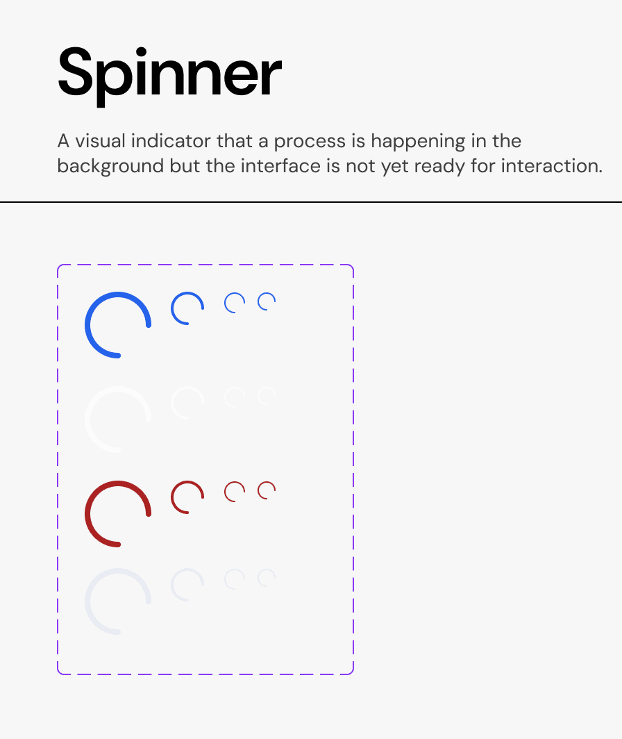
Properties:
A. Sizes
We provide four calibrated sizes to fit various containers without breaking the grid.
L (Large): Used for full-page loading or large modal bodies.
M (Medium): The default size for standard cards and content blocks.
S (Small): Optimized for use inside Buttons (e.g., "Saving...") or small input fields.
XS (Extra Small): Used in dense data tables or micro-interactions.
B. Types (Semantic Color)
Primary (Brand Blue): The default state for standard actions. Used on neutral backgrounds (white/grey).
Inverse (White/Grey): Used when the spinner appears on top of a dark or colored surface (e.g., inside a solid blue "Primary Button").
Error (Red): Rare use case. Indicates that a process is attempting to reconnect or recover from a failure state.
Mono (Neutral Grey): Used for subtle, low-priority loading states where the brand color would be too distracting.
Behavior:
The spinner rotates clockwise at a constant velocity.
When used inside a button, the button text (e.g., "Save") should be replaced or hidden by the spinner to prevent layout shifts.
Join our Community Forum
Any other questions? Get in touch