Tokens
Typography
The typography system is the primary vehicle for communication. It defines a standardized set of font families, weights, sizes, and line heights to ensure hierarchy, legibility, and visual rhythm across the platform.
Font Family:
Primary Typeface: DM Sans
Why: A geometric sans-serif that balances modern aesthetics with high legibility at small sizes. Its approachable character softens the data-heavy nature of financial interfaces.
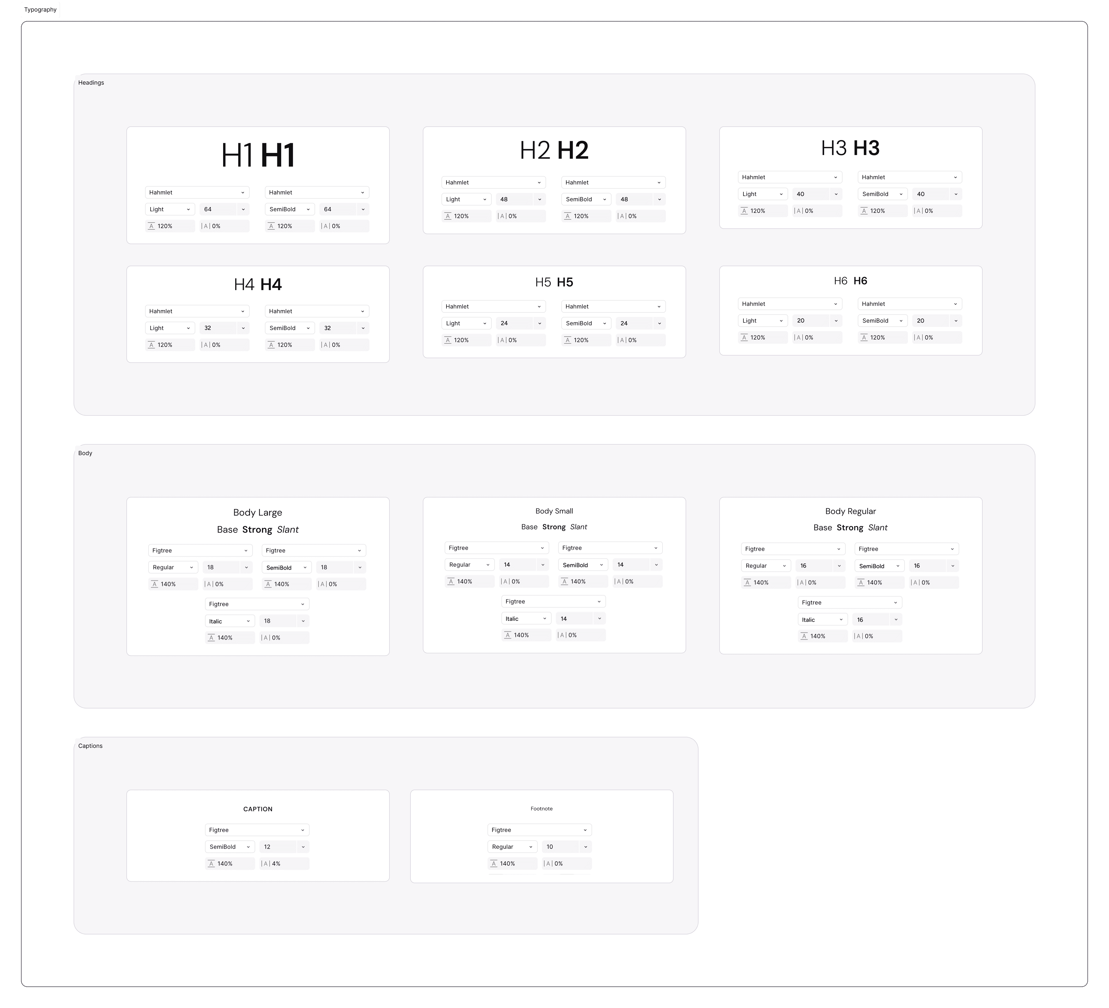
The Type Scale (Size & Leading)
Our scale is built on a geometric progression to ensure clear distinction between hierarchy levels.
Headings (Display):
10XL(72/80): Hero metrics and landing page titles.8XL(56/64): Section headers.6XL(40/48): Modal titles and key performance indicators.
Body (Content):
2XL(20/28): Lead paragraphs or introductory text.XL(18/26): Standard body text for memos.L(16/24): Default UI text (Buttons, Inputs, Lists).M(14/18): Secondary text, tooltips, and dense data tables.
Utility (Metadata):
S(12/16): Captions, timestamps, and validation messages.XS(10/14): Badges and micro-labels.
Line Height (Leading) Rule:
Headings: Tight leading (1.1 – 1.2x) to keep titles compact.
Body: Relaxed leading (1.5x) to improve readability for long-form reading (e.g., Investment Memos).
Letter Spacing (Tracking):
Headings: Tighter tracking (
-1%) to create a cohesive shape.Captions: Looser tracking (
+1%) to improve legibility at small sizes.
Text Styles (Usage Classes)
To ensure consistency across three products, we moved away from manual type settings to a strict class-based system. Designers must select from these pre-defined styles rather than adjusting size or weight manually.
Naming Convention: Category (Heading) — Level (H1) — Variant (Bold/Underlined)
A. Headings (Display & Structure)
Used for page titles, section markers, and high-level hierarchy.
H1 – H3 (64px – 40px): Reserved for "Hero" moments, Landing Pages, and major Dashboard KPIs.
H4 – H6 (32px – 20px): Standard page headers, modal titles, and card groups.
H7 – H10 (16px – 10px): Low-level subheads, table headers, and dense data labels.
Variant: Underlined styles are available for H8–H10 to denote interactive column headers in data grids.
B. Body Text (Content)
Used for long-form reading, descriptions, and standard UI elements.
Body Large (18px): Introductory paragraphs and lead text.
Body Regular (16px): The default size for standard reading (Memos, Emails).
Body Small (14px): Secondary descriptions and dense forms.
Body XSmall / 2XSmall (12px / 8px): Utility text, metadata, and footnotes.
Variant: Slant (Italic) is available for all body styles to denote quotes or system states (e.g., "Pending").
C. Interactive Styles (Buttons)
Optimized for clickability and vertical alignment within containers.
Button L (16px): Primary actions (Save & Next, Create Deal).
Button M (14px): Secondary actions and filters.
Button S / XS (12px / 10px): Tertiary actions, tags, and chips.
Join our Community Forum
Any other questions? Get in touch