Tokens
Radius
The Radius system governs the curvature of UI element corners. It defines the visual personality of the interface—balancing between "Technical/Precise" (Sharp) and "Friendly/Approachable" (Round).
Foundation:
Our radius scale is built on a specific logic to ensure consistency:
Interactive Elements use smaller radii to feel clickable and precise.
Containers use larger radii to feel like physical cards or surfaces.Naming Convention:
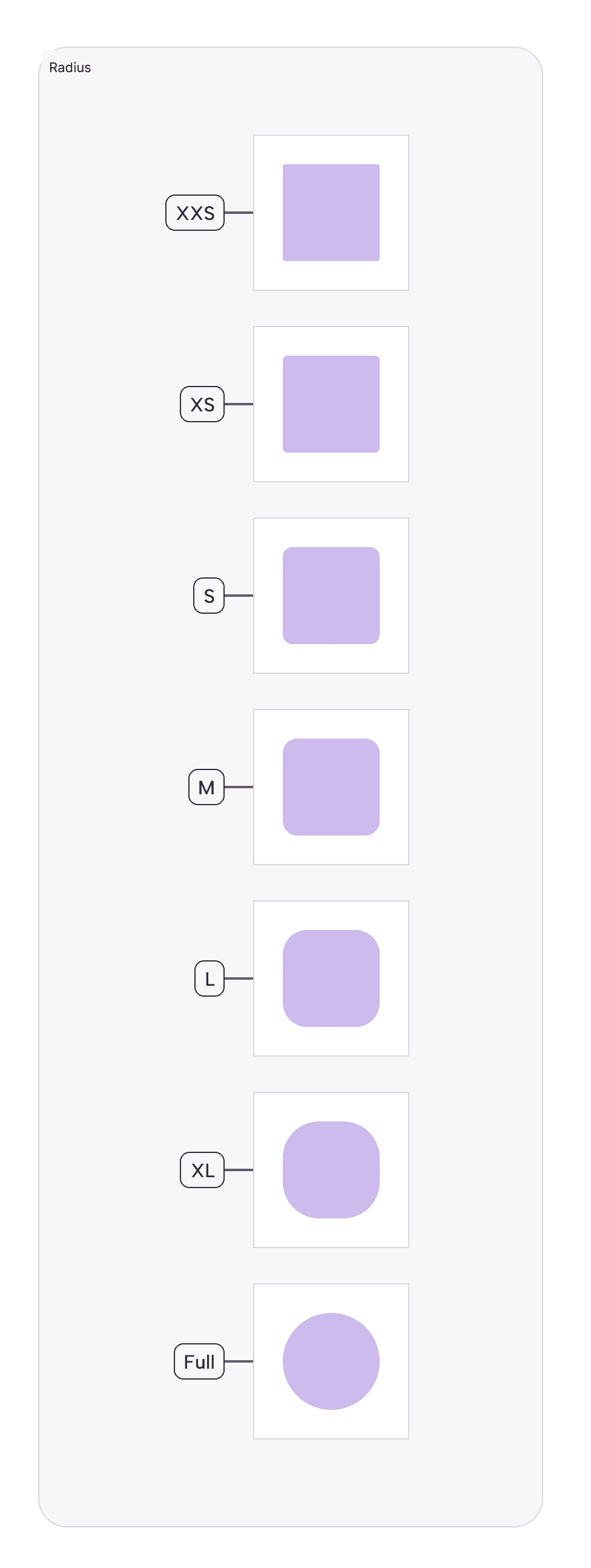
Radius Tokens:
Radius-XXS(2px):Usage: Micro-elements like internal badges, tags inside a dense table, or progress bar caps.
Why: At this scale, 2px is just enough to soften the edge without losing the rectangular definition.
Radius-XS(4px):Usage: Standard interactive inputs (Text Fields, Checkboxes) and small buttons (
Button-S).Why: Matches the "tight" aesthetic of data-heavy financial dashboards.
Radius-S(8px):Usage: The default for primary components (Large Buttons, Dropdown Menus, Toast Messages).
Why: 8px is the industry standard for "Modern SaaS," feeling friendly but professional.
Radius-M(12px):Usage: Medium containers (Popovers, Tooltips, Alert Dialogs).
Radius-L(20px):Usage: Large containers (Cards, Modals, Sidebars).
Why: Creates a distinct separation between the "Content" (Card) and the "Background."
Radius-XL(30px):Usage: Pills, Chips, and Toggle Switches.
Why: A fully rounded "Stadium" shape implies a different interaction model (Selection/Toggle) compared to a standard rectangular button.
Radius-FULL(999px):Usage: Avatars, Circular Action Buttons (FABs), and Status Dots.
Why: Forces a perfect circle regardless of size.
Join our Community Forum
Any other questions? Get in touch