Components
Badge
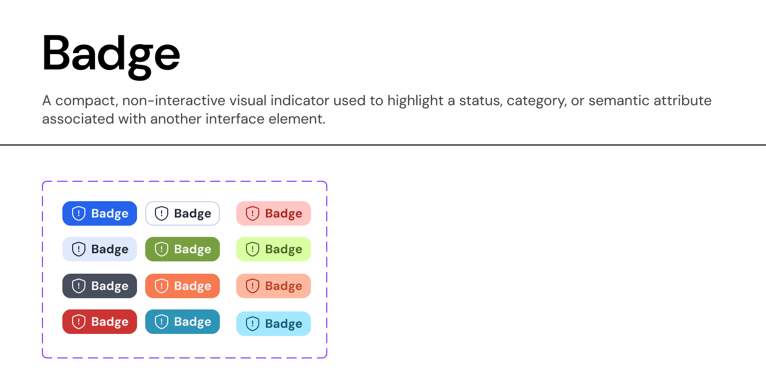
A Badge is a non-interactive visual indicator used to communicate the status, category, or attribute of an object. It uses semantic colors and keywords to allow users to scan and filter information quickly.
Anatomy & Slots:
Our Card component is built as a "Slot-Based" container to maximize flexibility while maintaining consistent padding and structure.
A. The Header Area
Content: Typically contains an Avatar, Title (
Heading Label), and Subtitle (Body Label).Actions: Supports a top-right action slot, often used for a "Close" (
X) button, "More Options" (...) menu, or a status badge.
B. The Body Slot
Definition: A flexible area designed to hold any component.
Usage: Can be swapped to contain data visualizations, text blocks, form inputs, or nested lists.
Placeholder: Labeled as
[swap slot]in the master component to indicate its dynamic nature.
C. The Footer Slot
Definition: A pinned area at the bottom of the card reserved for primary actions.
Usage: Contains high-emphasis buttons (e.g., "Done," "View Details") that apply to the entire card content.
Visuals: Often separated by a subtle divider or distinct padding to anchor the action.
Visual Properties:
Container: Uses
Surface-Primarybackground with aBorder-Neutral-Subtlestroke (1px).Radius: Uses
Radius-L(20px) to create a distinct, modern silhouette that separates it from the background canvas.Elevation: Supports a hover state with
Shadow-Sto indicate interactivity if the entire card is clickable.
Join our Community Forum
Any other questions? Get in touch