Components
File Uploader
The File Uploader allows users to transfer files from their local device to the system. It supports both drag-and-drop interactions and traditional file browsing, serving as the primary ingestion point for artifacts and data.
Usage Guidelines:
Do Use for mandatory artifact collection in wizards (e.g., "Upload PPM").
Do Use specifically defined dropzones that list supported formats to prevent error loops.
Do Not Use for uploading profile pictures (use an Avatar uploader instead).
Anatomy & Content:
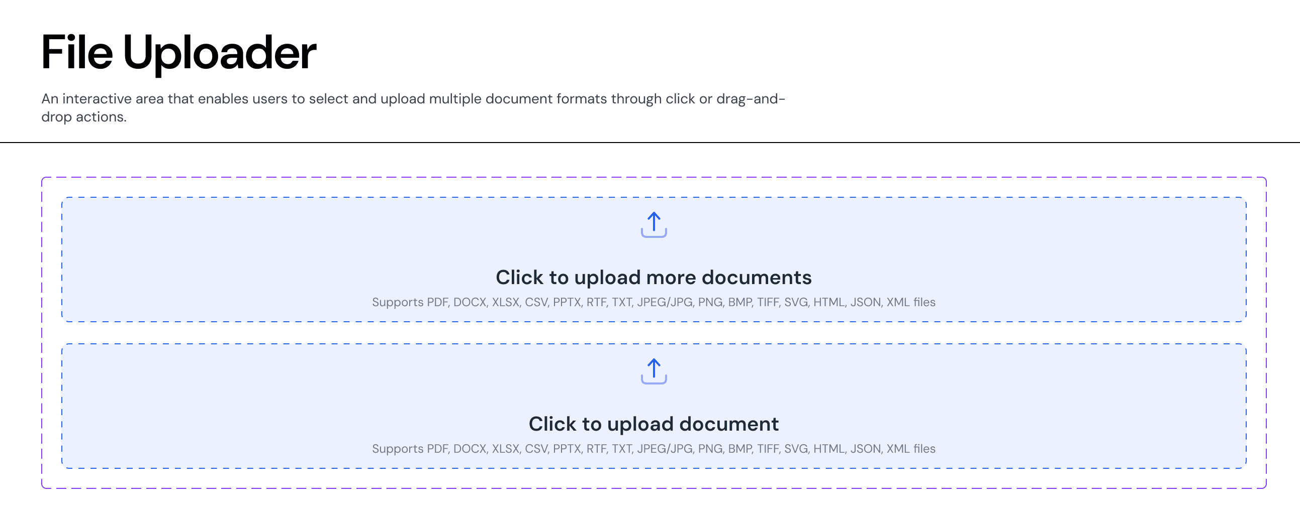
The Drop Zone
Visuals: A dashed border container (
Stroke-Style: Dashed) with aSurface-SecondaryorBrand-Subtlebackground to distinguish it from standard input fields.Icon: A central "Upload" arrow icon provides a clear affordance.
Label: Primary instruction (e.g., "Click to upload document").
Helper Text: Crucial metadata listing supported formats (PDF, DOCX, XLSX) to manage user expectations.
States (Properties)
The component supports distinct visual states to communicate the upload lifecycle.
Default (
uploadDone: No): The empty state waiting for interaction. Shows the prompt and upload icon.Success (
uploadDone: Yes): The container transforms to show the uploaded file name, a success checkmark, and often a "Remove" or "Replace" action.Visuals: Border becomes solid
Border-Semantic-Successor the background shifts toBackground-Semantic-Success-Subtle.
Behaviour
Drag & Drop: The container should highlight (darker border/background) when a user drags a valid file over the zone.
Validation: If an unsupported file type is dropped, the container should immediately transition to an Error State (Red border) with a specific error message (e.g., "File type not supported").
Join our Community Forum
Any other questions? Get in touch