Components
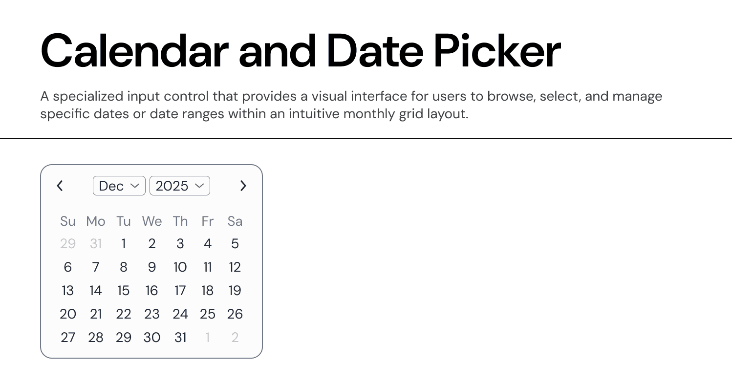
Calendar (Date Picker)
The Calendar component allows users to select a single date, a date range, or navigate through time periods. It is the primary input method for date-sensitive data fields.
Usage Guidelines:
Do Use to display the state of an object (e.g., "Active," "Pending," "Rejected").
Do Use to categorize items (e.g., "Fintech," "Series A").
Do Not Use for interactive elements. If the user needs to click it to remove filters or navigate, use a Chip or Tag instead.
Variants & Semantics:
The component supports a wide range of semantic types to cover all business logic scenarios.
Primary (Blue):
Usage: Key identifiers or "In Progress" states.
Success (Green):
Usage: Positive outcomes (e.g., "Completed," "Funded").
Warning (Orange):
Usage: Items requiring attention (e.g., "Review Needed," "Expiring").
Destructive (Red):
Usage: Critical states (e.g., "Failed," "Revoked," "High Risk").
Special (Purple/Gradient):
Usage: Premium status or AI-generated suggestions.
Neutral (Grey):
Usage: Drafts, inactive states, or secondary categories.
Anatomy & Configuration
The badge is designed for maximum flexibility within a compact footprint.
Container:
Shape: Uses
Radius-S(rounded corners) orRadius-XL(pill shape) depending on the context.Style: Supports Solid (High Emphasis), Subtle (Light Background), and Outline (Low Emphasis) to fit visual hierarchy.
Content:
Label: Concise, single-word or two-word text.
Leading Icon: Optional. An icon can be added to the left of the text to reinforce the meaning (e.g., a Shield icon for "Security Risk").
Property:
hasIcon(True/False).
Behaviour
Read-Only: Badges are strictly informational. They do not have hover or pressed states.
Truncation: If the text exceeds the maximum width of the container (typically constrained by a table column), the text should truncate with an ellipsis
..., but the full text should appear in a native browser tooltip.
Join our Community Forum
Any other questions? Get in touch