Components
Silder
An interactive control that allows users to select a specific value or range from a predefined set of values by moving a thumb along a horizontal track.
Usage Guidelines:
When to use:
Selecting a value where precise accuracy is not critical (e.g., "Investment Horizon: 5-10 Years").
Encouraging exploration of different inputs (e.g., "Adjusting Allocation %").
When NOT to use:
For extremely large ranges (1-10,000) where picking a specific number (e.g., 4,321) is difficult. Use an Input Field instead.
For discrete data sets with >5 options. Use a Segmented Control or Dropdown.
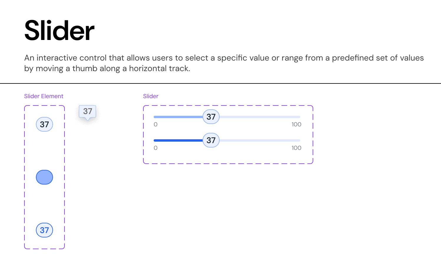
Anatomy & Visual Logic:
The Track:
Active Portion: Filled with
Primary-Brand-Blueto indicate the selected magnitude.Inactive Portion:
Surface-Neutral-Light(Grey-20) to indicate remaining potential.
The Thumb:
Visual: 24px Circle with
Elevation-Lowshadow.Focus State: Adds a 4px
Focus-Ring(Blue-20) for keyboard navigation visibility.
The Tooltip (The "Occlusion Solution"):
Problem: On mobile, the user's thumb covers the value they are trying to select.
Solution: When the user touches the thumb, the Value Tooltip (pill shape) elevates 32px vertically, sitting above the touch target so the number remains visible.
Interaction Specs:
Snap-to-Step: For financial sliders (e.g., "Equity %"), the slider snaps to increments of 5% to prevent "messy" numbers like 33.7%.
Range Logic: If two thumbs are present (Min/Max), they cannot cross each other. A minimum buffer of 1 step is enforced between them.
Join our Community Forum
Any other questions? Get in touch