Components
Button
Buttons initiate actions, trigger commands, or navigate users to new contexts. They are the primary interactive element for decision-making within the interface.
General Usage Guidelines:
Do Use precise, action-oriented labels (e.g., "Create Deal," not "Submit").
Do Use semantic colors (Red/Green) only for status-change actions to prevent visual noise.
Do Not Use buttons for page navigation (use Links) or data selection (use Radios/Checkboxes).
Types:
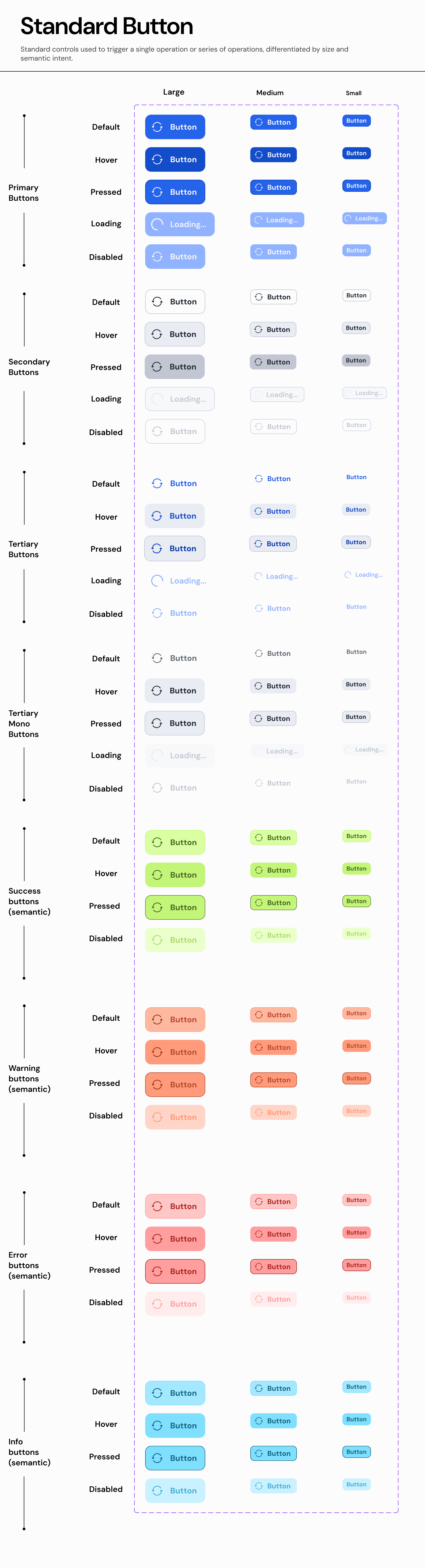
A. Standard Button
The default interactive element containing a text label and an optional leading/trailing icon.
Usage:
Use for the majority of explicit user commands on forms, modals, and pages.
Properties:
Size:
L(Hero/Modals) - 48px height.M(Default) - 40px height.S(Dense) - 32px height.XS(Table Actions) - 24px height.
Hierarchy:
Primary: High emphasis (Solid Fill). Max 1 per screen.
Secondary: Medium emphasis (Stroke). Standard actions.
Tertiary: Low emphasis (Ghost). Toolbar actions.
Tertiary Mono: Neutral grey for non-critical tools.
Semantic Variants:
Default (Blue/Grey): Neutral navigation or standard commands.
Success (Green): Positive finality (e.g., "Approve," "Mark as Done").
Warning (Orange): Actions with side effects (e.g., "Archive," "Deactivate").
Error (Red): Destructive actions (e.g., "Delete," "Revoke Access").
Info (Cyan): Contextual help or non-critical info requests.
States:
Default,Hover,Pressed,Loading(Spinner replaces text),Disabled.
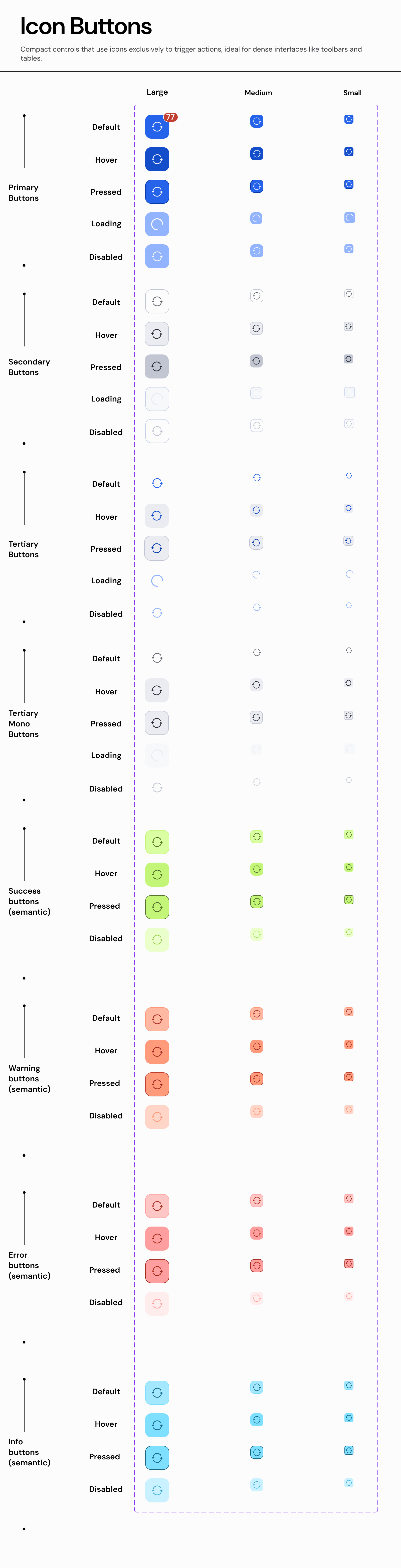
B. Icon Button
A button containing only an icon, used when screen real estate is limited.
Usage:
Use in toolbars, table rows, or headers where a text label would cause clutter.
Requirement: Must include a tooltip on hover for accessibility.
Properties:
Size:
L(32px),M(24px),S(16px).Hierarchy:
Primary,Secondary,Tertiary(Most common).Semantic Variants:
Default: Standard tools (Edit, Print, Filter).
Success: Row-level approval (e.g., a "Check" icon in a data table).
Warning: Flagging an item for review.
Error: Row-level deletion (e.g., "Trash" icon).
Info: Row-level details (e.g., "i" icon).
States:
Default,Hover,Pressed,Loading(Spinner replaces icon),Disabled.Badging: Supports Attention Dot (red dot) for status updates.
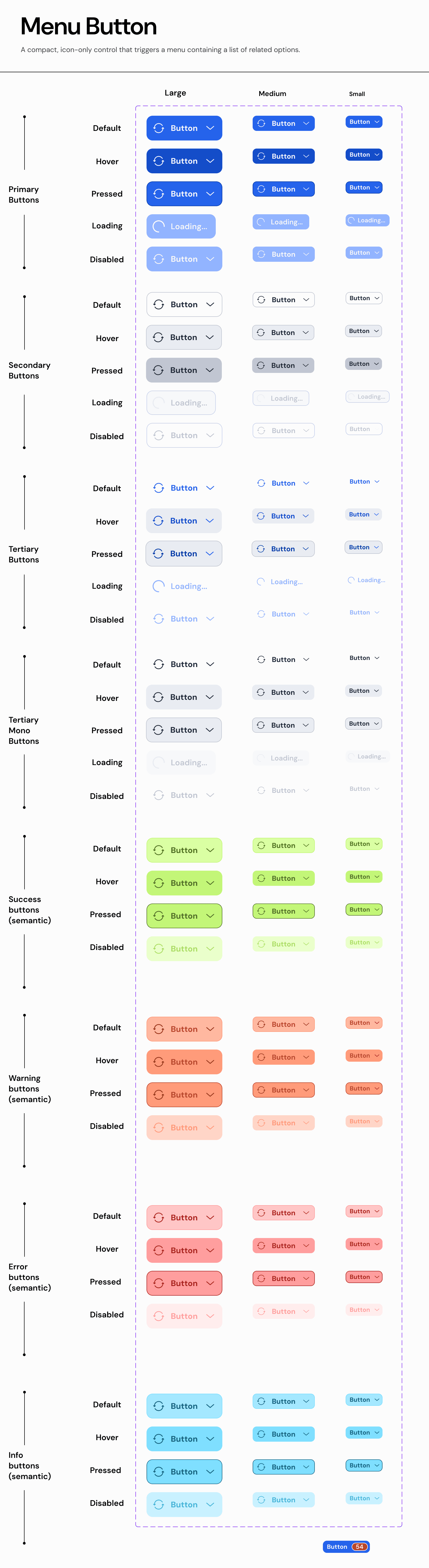
C. Menu Button
A button that opens a dropdown menu. It visually signals this behavior with a chevron icon.
Usage:
Use to group related commands into a single trigger (e.g., "Export As...").
Behavior: Clicking the button only opens the menu; it does not trigger a direct action.
Properties:
Size:
L,M,S.Hierarchy:
Primary,Secondary,Tertiary.Semantic Variants:
Default: Standard actions (e.g., "Actions").
Success: Bulk approval actions (e.g., "Approve All").
Warning: Status change menus (e.g., "Change Status to...").
Error: Bulk destructive actions (e.g., "Delete Selected").
Info: Help menus or filtering options.
States:
Default,Hover,Pressed(Menu Open),Disabled.
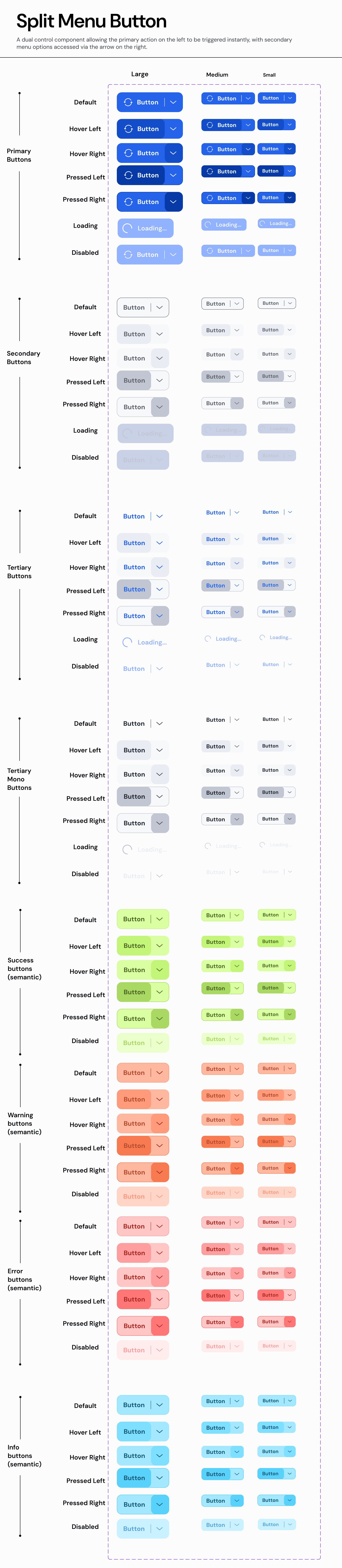
D. Split Menu Button
A dual-action control with a primary action area and a separate menu trigger (separator line + chevron).
Usage:
Use when a default action is highly probable (90%) but alternatives must remain accessible.
Properties:
Size:
L,M,S.Hierarchy:
Primary,Secondary.Semantic Variants:
Default: "Save" + "Save Options".
Success: "Publish" + "Publish Options".
Warning: "Hold" + "Hold Reasons".
Error: "Reject" + "Reject with Reason".
Info: "Request Info" + "Request Specific Docs".
States: Independent interaction states for the Action Area and Menu Area (e.g., hovering the arrow highlights only the arrow, not the main button).
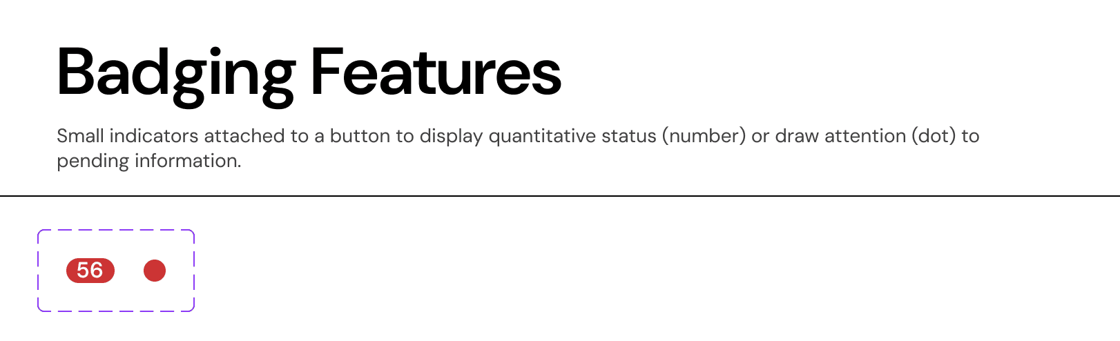
E. Badging Features
These properties can be applied to any button type to add context.
Counter Badge: A numeric pill overlaid on the button.
Usage: Indicates quantity (e.g., "Filters (3)").
Attention Dot: A small semantic dot.
Usage: Indicates unread notifications or status changes requiring review.
Join our Community Forum
Any other questions? Get in touch