Components
Menu
A Menu is a temporary surface that displays a list of actions or options. It appears when a user interacts with a button, action icon, or context trigger.
Usage Guidelines:
Do Use menus to group related commands (e.g., "Sort By," "Export") to save screen real estate.
Do Not Use menus for primary navigation (use a Sidebar or Tab Bar instead).
Do Not Use menus for complex forms (use a Dialog/Modal instead).
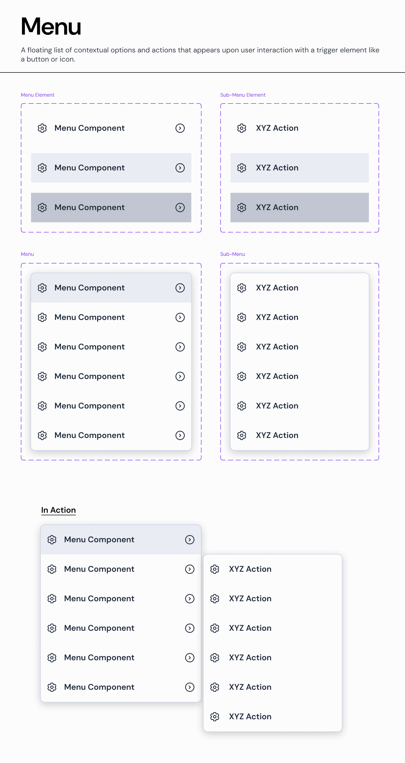
Menu Item Types:
A. Standard Action
A single-line list item that triggers an immediate command.
Anatomy: Icon (optional) + Text Label.
Usage: Simple commands like "Edit," "Duplicate," or "Delete."
B. Navigation Item (Submenu Trigger)
A list item that opens a nested level of options. Visually distinguished by a right-facing chevron (>).
Anatomy: Icon + Text Label + Chevron Icon.
Behavior:
Desktop: Opens the submenu on Hover or Click (depending on context).
Interaction: The parent menu remains open while the submenu is active.
C. Destructive Action
A specialized item for dangerous commands.
Visual: Uses
Text-Semantic-Error(Red) to signal risk.Usage: "Delete" or "Revoke Access."
Hierarchy & Nesting:
The Parent-Child Relationship
Our system supports unlimited nesting, though we recommend a maximum depth of 2 levels (Parent > Submenu) to prevent usability issues.
Visual Separation: Submenus appear physically adjacent to the parent item, typically aligned to the right edge.
Focus Management: When a submenu opens, focus moves to the first item in the new list.
States & Interaction:
Default: The resting state. Background is
Surface-Overlay.Hover: The item background changes to
Background-Neutral-Subtleto indicate focus.Note: For Submenu Triggers, the hover state also triggers the appearance of the child menu.
Disabled: Text opacity is reduced to 30%, and the item is non-interactive.
Join our Community Forum
Any other questions? Get in touch