Tokens
Color Usage
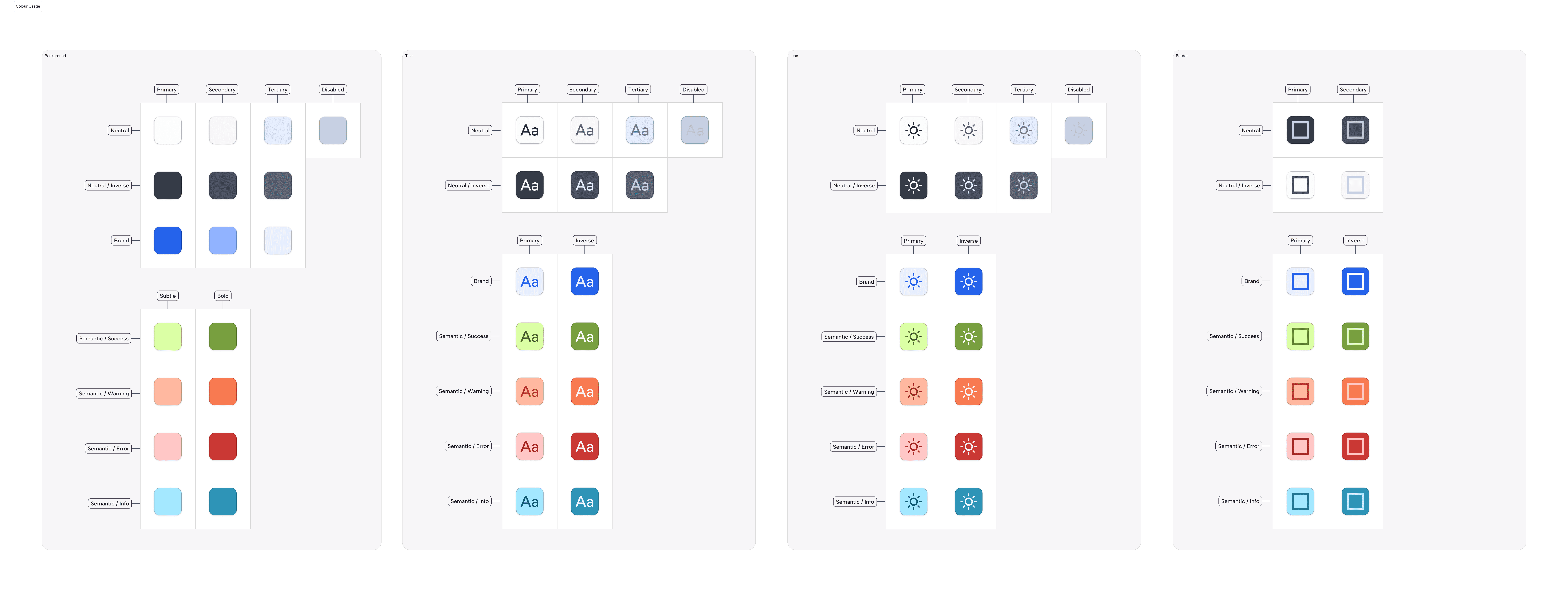
Color Usage defines the semantic layer of the design system. Unlike Primitives, which describe what a color looks like (e.g., Blue-60), Usage tokens describe how a color functions (e.g., Background-Brand-Primary).

Why we use it:
This abstraction layer allows us to map a single token name to different raw values depending on the context. It is the architectural foundation that enables instant, system-wide theming (Light/Dark mode) and ensures accessible contrast ratios across all products without manual overrides.
Naming Convention:
All semantic tokens follow a strict taxonomy: Category (Background) — Group (Neutral) — State/Role (Primary)
The Palette Structure:
A. Background Tokens
Definition: Background tokens define the fill colors for surfaces, containers, and interactive elements.
Background-SemanticUsage: Status indicators and feedback loops.
Tokens:
Success: Validations and positive states (Light:Green-30/ Dark:Green-20).Warning: Non-blocking alerts (Light:Orange-30/ Dark:Orange-30).Error: Critical failures or validation errors (Light:Red-20/ Dark:Red-20).Info: Informational highlights or neutral system messages (Light:Blue-30/ Dark:Blue-20).
B. Text Tokens
Definition: Text tokens control the color of typography to ensure legibility and establish information hierarchy.
Text-SemanticUsage: Communicating status through text.
Tokens:
Success: Positive values or confirmation text (Light:Green-90/ Dark:Green-50).Warning: Cautionary text (Light:Orange-80/ Dark:Orange-50).Error: Error messages (Light:Red-70/ Dark:Red-50).Info: Helpful hints or links (Light:Blue-90/ Dark:Blue-40).
C. Icon Tokens
Definition: Icon tokens ensure that vector symbols maintain visual consistency with their accompanying text labels.
Icon-SemanticUsage: Status icons (checks, warnings, alerts, info-circles).
Tokens:
Success: Checkmarks (Light:Green-90/ Dark:Green-60).Warning: Alert triangles (Light:Orange-80/ Dark:Orange-50).Error: Failure indicators (Light:Red-70/ Dark:Red-50).Info: Information or help icons (Light:Blue-90/ Dark:Blue-50).
D. Border Tokens
Definition: Border tokens define the strokes for containers, inputs, and dividers.
Border-SemanticUsage: State indication on containers or inputs.
Tokens:
Success: Validated fields (Light:Green-80/ Dark:Green-60).Warning: Cautionary borders (Light:Orange-70/ Dark:Orange-50).Error: Invalid fields (Light:Red-70/ Dark:Red-50).Info: Highlighted containers or active info cards (Light:Blue-80/ Dark:Blue-50).
Accessibility Standards:
Definition: Our semantic token system is mathematically calibrated to ensure consistent contrast ratios across both Light and Dark modes, adhering to WCAG 2.1 AA standards.
The Rules:
Text Contrast: All
Text-*-PrimaryandText-*-Secondarytokens maintain a minimum 4.5:1 contrast ratio against their default surface tokens.Non-Reliance on Color: We never use color as the sole indicator of status. All
Semantic-ErrororSemantic-Warningstates are designed to be paired with an accompanying icon or text label to support color-blind users.Inverted Mode: Dark mode is not just an inversion; it utilizes distinct
Neutralscales to prevent "vibration" (eye strain) caused by pure white text on pure black backgrounds.
Join our Community Forum
Any other questions? Get in touch