Components
Avatar
An Avatar is a visual representation of a user, team, or entity. It is used to quickly identify people or organizations within lists, headers, and comment threads.
Usage Guidelines:
Do Use avatars to humanize the interface and provide quick visual recognition.
Do Use the "Initials" variant as the default fallback when no profile image is available.
Do Not Use avatars for purely decorative purposes; they must represent a specific identity.
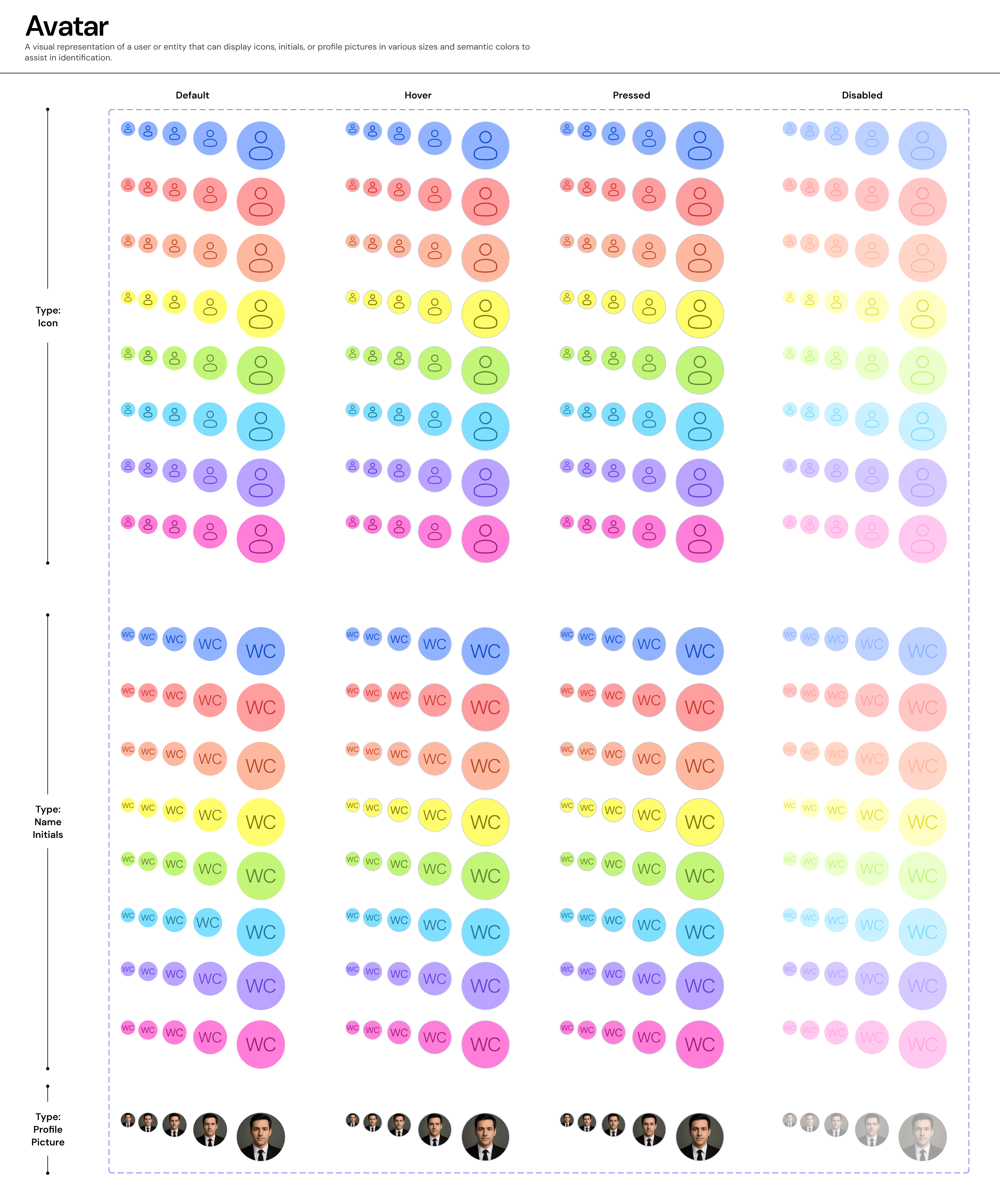
Variants & Fallback Logic:
The component supports three distinct modes to handle data availability:
A. Profile Image (Primary)
Usage: Used when a user has uploaded a photo.
Behavior: The image is masked to a perfect circle (
Radius-FULL).
B. Name Initials (Fallback)
Usage: Used when no image is available but the user's name is known (e.g., "Wild Cat" -> "WC").
Visuals: Uses
Background-Brand-Subtleor a specific semantic color with high-contrast text.
C. Icon (Generic)
Usage: Used for anonymous users or when the entity type is generic (e.g., "Guest").
Visuals: Uses a standard
Usericon stroke.
Sizes & Properties:
We provide a calibrated scale to fit various contexts.
XL (48px): Profile pages and major headers.
L (40px): Standard lists and table rows.
M (32px): Card headers and navigation bars.
S (24px): Dense data tables or inline mentions.
XS (16px): Micro-interactions (e.g., "Edited by [Avatar]" footer).
States & Interaction:
Default: The static representation.
Hover: A subtle overlay or border highlight indicates interactivity (if the avatar triggers a profile menu).
Pressed: Tactile feedback for clickable avatars.
Color: Supports semantic coloring (
Brand,Red,Orange) to indicate status (e.g., an "Offline" or "Busy" state border).
Join our Community Forum
Any other questions? Get in touch