Components
Toggle
A digital switch used to instantly change the state of a single setting between "On" and "Off".
Usage Guidelines:
When to use:
For "System State" changes that take effect immediately (e.g., "Enable Notifications," "Dark Mode").
For binary choices that are standalone (not part of a form submission).
When NOT to use:
In place of a Checkbox (e.g., "I agree to Terms").
For lists of multi-select items.
If the user has to click "Save" for the change to happen.
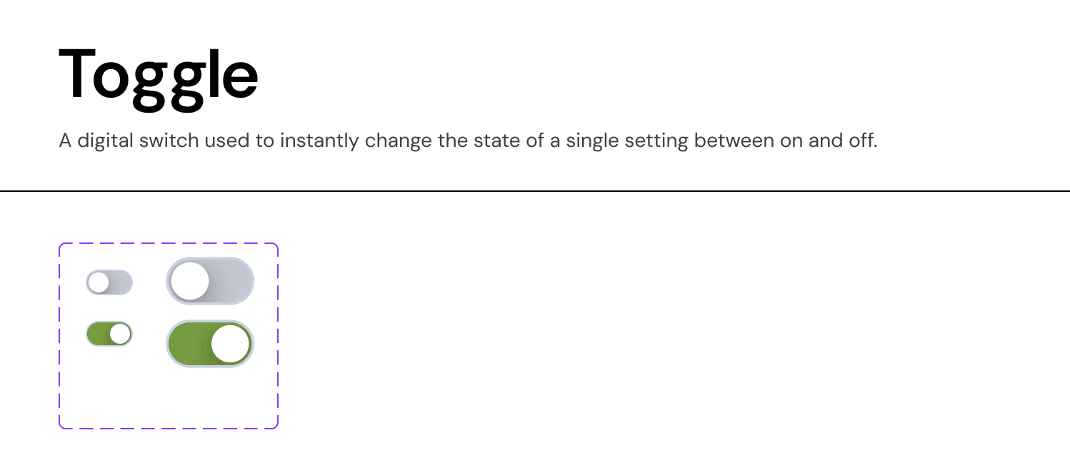
Anatomy & Visual Logic:
The Track:
Off State:
Surface-Neutral-Dark(Grey-30). Signals "inactive."On State:
Success-Green(orBrand-Primary). Signals "active."
The Thumb:
Position: Left-aligned for Off, Right-aligned for On.
Visual: Pure White circle.
Sizes:
Small (24px): Used in dense data tables or settings lists.
Medium (32px): Used in primary UI cards and mobile views for better touch targeting.
Accessibility Notes
Color Independence: Do not rely solely on color (Grey vs. Green) to convey state. The Position of the thumb (Left vs. Right) is the primary semantic indicator.
Labeling: Every toggle must have a clear text label on the left (e.g., "Show Archived Deals"). Avoid ambiguous labels that require the user to guess what "On" means.
Join our Community Forum
Any other questions? Get in touch