Components
Breadcrumbs
Breadcrumbs provide a secondary navigation scheme that reveals the user's location in the website's hierarchy. They allow users to navigate back to parent levels of the current page effectively.
Usage Guidelines:
Do Use in deep hierarchies (3+ levels) like "Deal Details" or "Fund Performance" where users need context on where they are.
Do Use as a supplement to the primary navigation, never as a replacement.
Do Not Use on the highest-level pages (e.g., the Home Dashboard) where the context is obvious.
Anatomy & Properties:
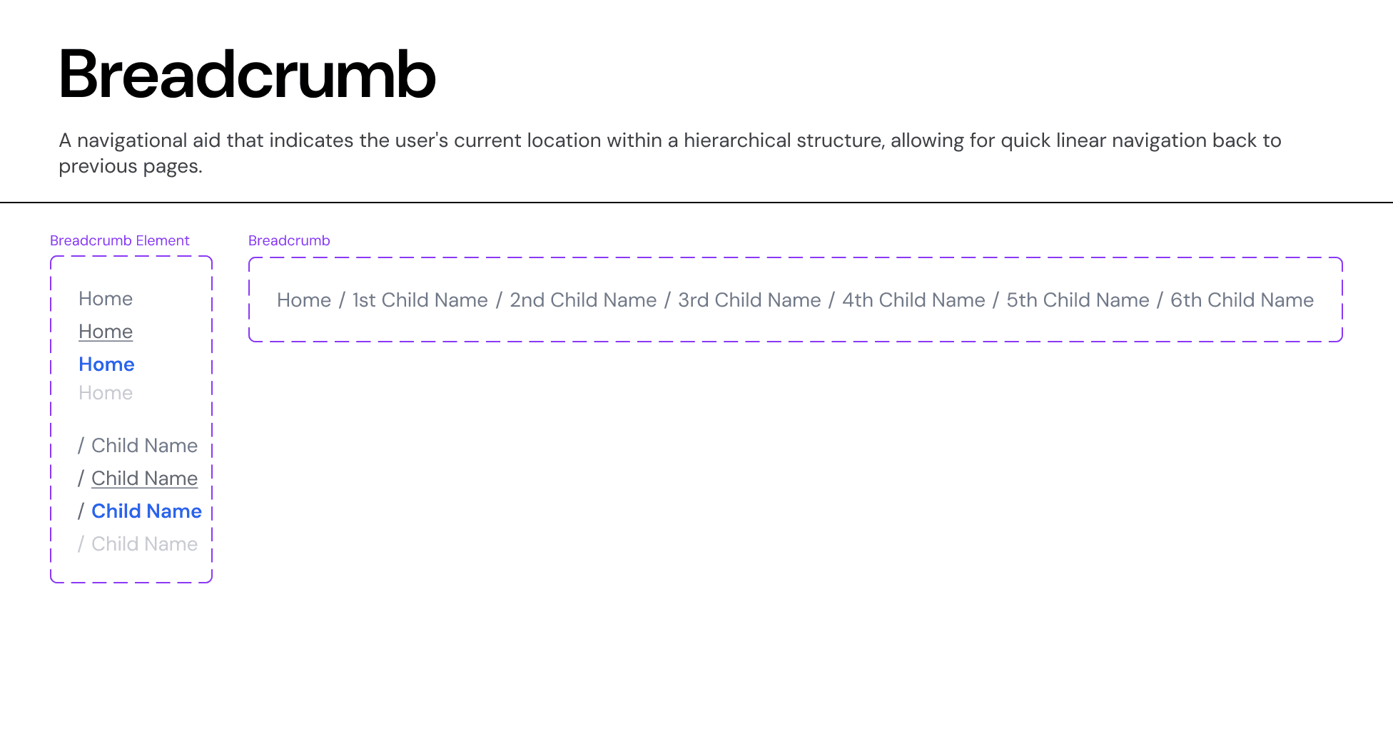
A. The Hierarchy Path
A linear list of links separated by dividers.
Root Item: The starting point (e.g., "Home" or "Funds").
Separators: A forward slash
/is used to visually separate levels.Current Page: The last item in the list represents the current active page.
B. Interaction States
Parent Items (Interactive):
Default: Neutral Grey text.
Hover: Text becomes underlined or shifts color to
Brand-Primaryto indicate clickability.Click: Navigates the user to that specific parent folder.
Current Item (Non-Interactive):
State:
Text-Neutral-Primary(Dark Grey) orText-Brand-Primary(Blue), depending on emphasis.Interaction: It is not clickable as the user is already there.
Truncation Logic:
In deep paths where the breadcrumb exceeds the container width:
Collapse Middle Items: Intermediate levels are replaced with an ellipsis (
...) button.Example:
Home / Funds / ... / Deal Details.
Interaction: Clicking the
...reveals a dropdown menu containing the hidden path items.
Variants:
Standard Breadcrumb: Uses a subtle text style (
Body-SorBody-XS) to avoid competing with the Page Title.Back Link: A simplified variant (Icon + "Back to Funds") used on mobile or focused detail views where full hierarchy is too wide.y-step processes where focus is paramount.
Join our Community Forum
Any other questions? Get in touch