Components
Table
The Table component displays sets of data across rows and columns. It organizes high-density information in a grid format, allowing users to scan, compare, and analyze metrics efficiently.
Usage Guidelines:
Do Use for large datasets (e.g., "Fund Performance Metrics") where comparison between items is critical.
Do Use when the data requires sorting, filtering, or bulk actions.
Do Not Use for simple lists of actionable items (use a List/Card layout instead) where the visual hierarchy of the item is more important than the data points.
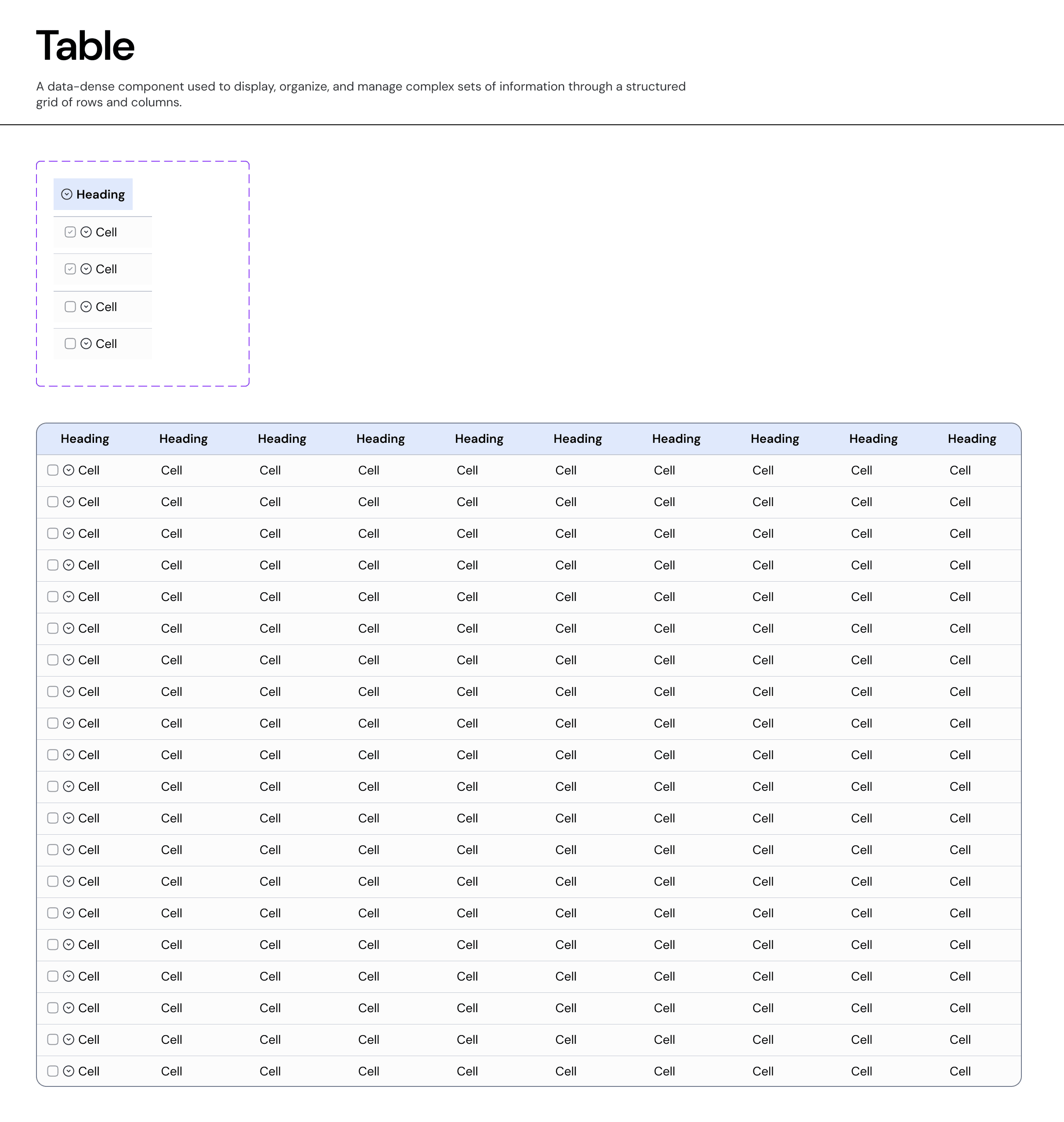
Anatomy & Features:
A. The Header Row
Label: clearly defines the data attribute (e.g., "Fund Name," "IRR").
Sorting: Clickable headers allow users to sort the dataset ascending/descending. Visually indicated by a sort icon next to the label.
Bulk Selection: A master checkbox in the header selects all visible rows.
B. The Data Row
Cells: Can contain text, numeric values, badges, or micro-charts.
Selection: A checkbox column allows for multi-select operations (e.g., "Compare Funds").
Hover State: The entire row highlights on hover (
Background-Neutral-Subtle) to aid readability across wide viewports.
Advanced Capability: The Tree Table (Nesting)
Our system supports Hierarchical Data (Parent/Child relationships) within the standard grid structure.
Usage: Used when line items belong to a broader category (e.g., Sector > Product Lines or Fund > Portfolio Companies).
Behavior:
Expand/Collapse: A chevron icon appears in the first column of "Parent" rows. Clicking it reveals "Child" rows directly below.
Indentation: Child rows are visually indented to indicate their subordinate level.
Selection Logic: Selecting a Parent row automatically selects all nested Child rows.
Interaction States
Default: Standard text on
Surface-Primary.Hover: Row background shifts to
Neutral-Subtle(Light Grey) to guide the eye.Selected: Row background shifts to
Brand-Subtle(Light Blue) and the checkbox is checked to confirm active status.Focus: Keyboard navigation highlights individual cells for editing or copying.
Join our Community Forum
Any other questions? Get in touch